Sep 1, 2023
Objectives – Exploring Einstein AI and Advanced Analytics

Introduction

This chapter will focus on the concept of advanced analytics and its applications in Tableau and Salesforce. The chapter will begin by defining advanced analytics and its capabilities in providing deeper insights and predictions from data. The chapter will then cover the use of advanced analytics in Tableau, highlighting relevant features. Additionally, the chapter will delve into advanced analytics in Salesforce, including its Einstein platform and its capabilities for machine learning and AI-powered insights. Lastly, the chapter will guide how to create a combined analytical use case across Tableau and Salesforce, leveraging the strengths of both platforms for enhanced data analysis and decision-making.

Structure

The chapter covers the following topics:

  • Advanced analytics
  • Using advanced analytics in Tableau
  • Using advanced analytics in Salesforce
  • Combining Tableau and Salesforce for advanced Analytics

Objectives

This chapter provides learners with a comprehensive understanding of advanced analytics and its significant role in interpreting data and aiding decision-making. It explores the potential of advanced analytics to yield deeper insights and more accurate predictions. Learners will discover how to harness the capabilities of advanced analytics in Tableau, leading to robust data visualization and exploration. The chapter also imparts knowledge about Salesforce’s Einstein platform, which incorporates machine learning and artificial intelligence to facilitate advanced analytics. Additionally, it explains how Salesforce utilizes advanced analytics to enhance customer relationship management and other business functions.

A key focus of the chapter is teaching learners how to create a combined analytical use case that leverages the strengths of both Tableau and Salesforce for improved data analysis. This involves understanding the integration and synergies between these platforms, which is crucial for optimizing their use in a business context. Finally, learners are encouraged to apply the techniques and knowledge acquired to real-world problems. This application not only enhances their data analysis skills but also bolsters their strategic decision-making capabilities, equipping them with the tools to make informed, data-driven decisions in various business scenarios.

More Details
Aug 17, 2023
Conclusion – Blending Tableau with Traditional CRM Analytics

In this chapter, we have journeyed through the crucial domain of CRM Analytics and its paramount role in understanding, managing, and improving customer relationships. You should now be able to grasp the full picture of CRM Analytics, its key features, and how it facilitates thorough analysis of customer data through datasets and lenses.

The concept of Einstein Discovery within Salesforce, and its application in the CRM Analytics platform, was another essential part of our journey. Now, you should be capable of creating and utilizing Einstein Discovery models to enhance your data interpretation and decision-making processes.

Finally, we discussed the use of the CRM Analytics Tableau Output Connector, a bridge that allows Salesforce data to flow seamlessly into Tableau. This key tool enables you to perform detailed, insightful analysis of your Salesforce data, further enriching your understanding and enabling you to derive practical benefits.

In sum, we have armed you with a comprehensive understanding of CRM Analytics within Salesforce, its integration with Tableau, and the immense value these tools bring to your organization. Now, you should feel confident to apply these skills in your own work, harnessing the power of CRM Analytics and Tableau to transform raw data into strategic actions, and thereby improve your business operations and customer relationships.

We will now move on to putting our hard work on setting up CRMA to use inside Tableau for advanced analytics use cases, while also covering the basics of what advanced analytics are really all about in the process.

Join our book’s Discord space

Join the book’s Discord Workspace for Latest updates, Offers, Tech happenings around the world, New Release and Sessions with the Authors:

https://discord.bpbonline.com

More Details
Jul 5, 2023
Using the Tableau online output connection – Blending Tableau with Traditional CRM Analytics

The Tableau Online Output Connector is a powerful tool that enables you to seamlessly push your prepared data from CRM Analytics into Tableau Online for further analysis. By transforming, merging, and cleaning your data in CRM Analytics, you can easily create a .hyper file that can be analyzed using Tableau Online’s advanced analytics tools. This connector is designed to work with Data Prep recipes and requires a Creator license for the Tableau Online account. In this section, we will walk you through the process of enabling the Tableau Online Output Connector, configuring connection settings, and pushing data to Tableau Online.
In this example, we will write the opportunity_history dataset that we have been using all through this chapter to our Tableau Cloud environment, using the Tableau Online Output Connector.
To do so follow the instructions below:

  1. First, go to setup and search for analytics in the Quick Find box. Click Settings.
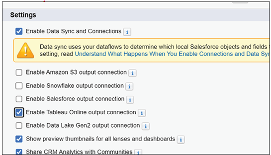
  2. Under settings, shown in the following screenshot, enable the Tableau Online output connection and save:

Figure 8.39: Analytics settings showing Tableau connector

  1. Go to Analytics Studio and click Data Manager, then from the page that appears, click Connections. This should look like the following screenshot:

Figure 8.40: Data manager showing connections

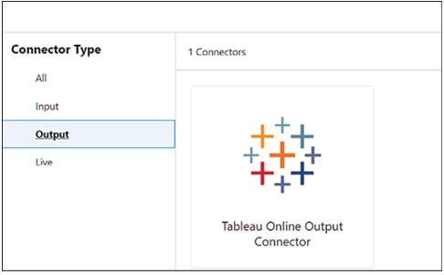
  1. Click New Connection, select Output under Connector Type and click Tableau Online Output Connector, as shown below:

Figure 8.41: New connection dialogue

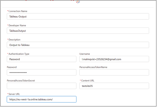
  1. Now fill in the information as in the screenshot below. You can refer to this URL for the details of the parameters if needed: https://help.salesforce.com/s/articleView?id=sf.bi_integrate_connectors_output_tableau_hyper.htm&type=5

Figure 8.42: Tableau Online connector configuration

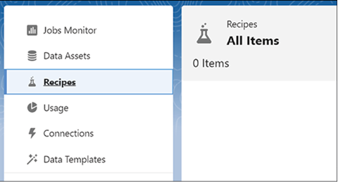
  1. Now you have established the connection. Time to test it. To do so, go back to Data Manager and click on Recipes, as shown in the following screenshot:

Figure 8.43: Data manager recipes tab

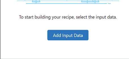
  1. On the Canvas that appears, click Add Input Data, shown in the following screenshot:

Figure 8.44: Add input data button

  1. Select the opportunity_history dataset, as shown in the following figure:

Figure 8.45: opportunity_history dataset selected as input

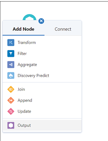
  1. Now add a node by clicking on “+”. Select Output, shown below:

Figure 8.46: Output node being added

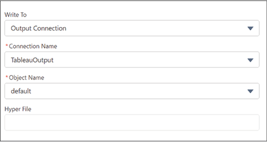
  1. Fill out the form as per the screenshot below:

Figure 8.47: Output node configuration

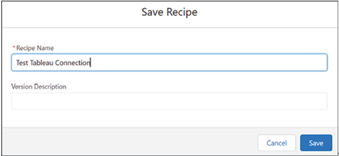
  1. Save and Run the Recipe by clicking on the button and giving it a name, for instance as in the following screenshot:

Figure 8.48: Save and run recipe dialogue

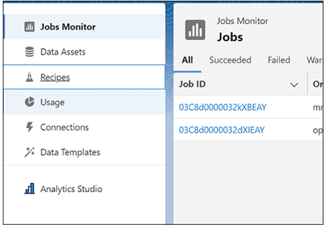
  1. The job will now run, so wait until it has been completed. You can monitor this in Jobs Monitor, shown in Figure 8.49:

Figure 8.49: Jobs monitor showing recipe run
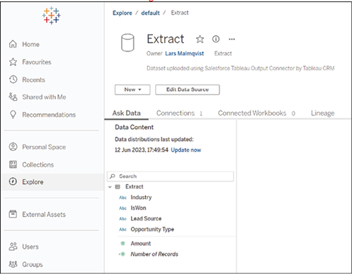
When the job is complete, you can find and explore the dataset in Tableau Cloud by clicking Explore, selecting default, and then clicking on Extract, which is the extract you have just created. This will look as in the following screenshot:

Figure 8.50: Explore dataset in Tableau dialogue
We have now covered the material for this chapter. Well done! However, we have even further heights to scale as we explore the world of advanced analytics in Chapter 9 – Exploring Einstein AI and Advanced Analytics.

More Details
May 3, 2023
Creating an Einstein Discovery Model and using it from CRM Analytics – Blending Tableau with Traditional CRM Analytics

Einstein Discovery, a cutting-edge machine learning platform developed by Salesforce, is designed to bring transparent predictions and recommendations to users within Tableau workflows and in Salesforce CRM. This powerful tool enables data scientists, analysts, and business users to create predictive models without writing any algorithms. With its intuitive, no-code environment, Einstein Discovery empowers individuals and organizations to make smarter, more informed decisions guided by ethical and transparent AI.
In this section, we will create an Einstein Discovery model based on our opportunity history data and investigate it within CRM Analytics. In Chapter 9 – Exploring Einstein AI and Advanced Analytics, we will examine how to use this model from within Tableau.
To create a model and investigate its parameters, use the following steps:

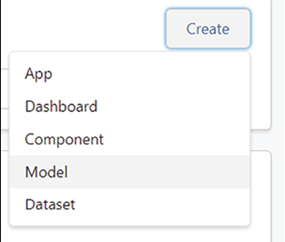
  1. Go to Analytics Studio and click Create | Model, as demonstrated in the following screenshot.

Figure 8.28: Model creation dialogue

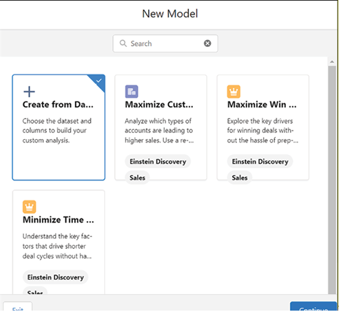
  1. Choose Create from Dataset in the dialogue that appears, shown below:

Figure 8.29: Create from dataset dialogue

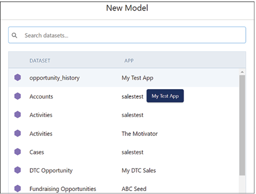
  1. Now select the opportunity_history dataset that we have previously created, as indicated in the following screenshot:

Figure 8.30: opportunity_history dataset selected

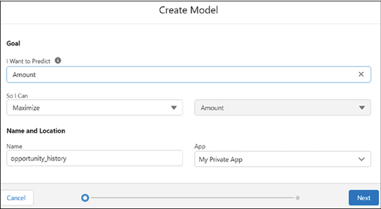
  1. As the goal, follow the settings in the following screenshot to maximize the amount of the opportunity:

Figure 8.31: Model goal configuration
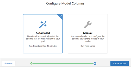
Einstein Discovery allows for considerable freedom in manually configuring the model that you want. However, for the purposes of this exercise, we will simply allow it to make the decisions itself. Therefore, select Automated in the Configure Model Columns dialogue. Note that this does mean we will take into account whether the opportunity was won or not, which you may want to exclude in a real scenario. However, in this scenario, the influence is not huge, so keeping it in does not materially change the result. You can see this in the following screenshot:

Figure 8.32: Automated configuration selected
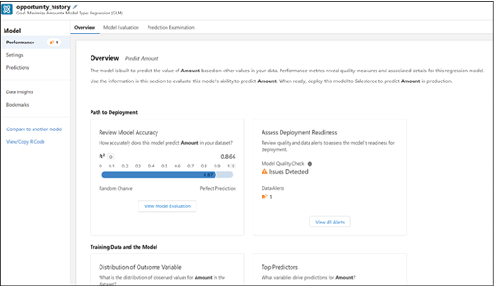
The system will now build your model, which usually takes 5 to 10 minutes. When it is done, you should see the following overview. You can check the alert and also note that at the highest level, shown in the screenshot below, the model’s prediction seems fairly good.

Figure 8.33: Model overview showing performance
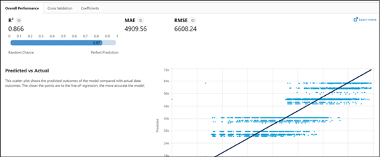
If you now click on the Model Evaluation tab, you can see more detail about the model performance. This is shown in Figure 8.34:

Figure 8.34: Model evaluation report
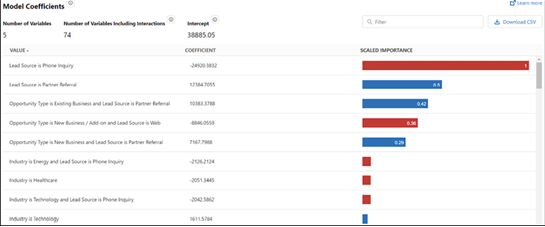
It is also worth going into the Model Coefficients tab, shown below, where you can see the most important variables in the model for predicting the opportunity amount.

Figure 8.35: Model coefficients tab
Now go into the Prediction Examination tab, shown in the following screenshot, where you can see how the model classified actual data from the training dataset. This can give you a good sense of how it will work in practice.

Figure 8.36: Prediction examination tab
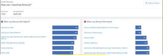
On the Data Insights tab, shown in Figure 8.37, accessible from the sidebar, you get an overview of what factors play the biggest role in making the amount high or low.

Figure 8.37: Data insights overview
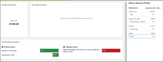
Finally, on the Predictions tab, shown in Figure 8.38, you can actually test out different values and see what the model predicts.

Figure 8.38: Predictions tab
Have a good play with the different aspects of the model, and now, we will move on to look at the Tableau Online Output Connection.

More Details
Mar 13, 2023
Making a dashboard – Blending Tableau with Traditional CRM Analytics

A dashboard is an engaging compilation of widgets that display the results of data queries. In this section, you will create a dashboard with an interactive chart and a list widget. You will incorporate the lens from the previous step and explore tools in the dashboard designer.
To incorporate a lens into a dashboard, you need to clip it. Clipping the lens allows CRM Analytics to add the query as a step in a new dashboard (or the most recently used open dashboard).

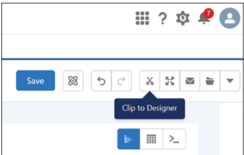
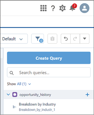
  1. In your newly created lens, click the Clip to Designer icon, marked in the following screenshot, to clip the query.

Figure 8.20: Clip to designer icon

  1. Under Display Label, enter Breakdown by Industry and click Clip to Designer.
  2. CRM Analytics will open the dashboard designer and add the query in the query panel. Breakdown by Industry will be displayed under the opportunity_history dataset.

Figure 8.21: Lens added to designer with query name showing

  1. Drag the Breakdown by Industry query onto the new dashboard grid.
  2. Resize the chart by dragging its corner to make it larger. The result should look like the following screenshot:

Figure 8.22: Query chart resized on dashboard
Widgets are the basic building blocks of a dashboard, providing various functions such as displaying key performance indicators, filtering dashboard results, visualizing data using interactive charts, or showing record-level details in tables. In this step, you will add a list widget to enable dashboard users to facet all the charts in the dashboard.

  1. Drag the List widget icon, shown in the screenshot, from the left side onto an empty space on the dashboard underneath the chart.

Figure 8.23: List widget being added to dashboard

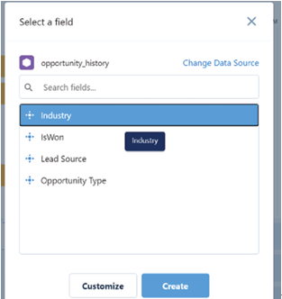
  1. Click on the List widget and select Industry.
  2. Click Create in the window shown in the next screenshot:

Figure 8.24: Industry field selected for list

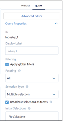
  1. Select the list widget by clicking on it.
  2. In the Properties panel on the right, click the Query tab.
  3. Ensure that both Apply global filters and Broadcast selections as facets are selected.
  4. Under Selection Type, choose Multiple Selection, shown in Figure 8.25:

Figure 8.25: List widget properties

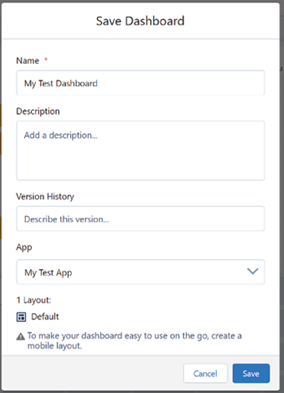
  1. Save your dashboard by clicking the Save button.
  2. Enter My Test Dashboard as the title of your new dashboard, and select App | My Test App from the dropdown menu, as shown below:

Figure 8.26: Save dashboard dialogue

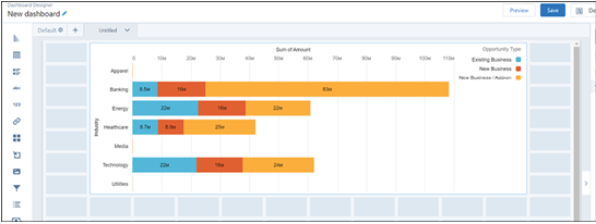
  1. Click Save to complete the process. You can preview your dashboard, which should look like this:

Figure 8.27: Completed test dashboard
You have now created a basic dashboard. We hope you will explore the potential of CRM Analytics much further on your own, but for now we will move on to Einstein Discovery, the machine learning engine that powers CRM Analytics.

More Details
Jan 7, 2023
Building a lens – Blending Tableau with Traditional CRM Analytics

A lens is a visual representation of the data within a dataset, allowing you to explore data graphically and construct queries for a dashboard. To build a lens, follow the steps below:

  1. Click on the Analytics Studio tab to return to the CRM Analytics Home page.
  2. Click Browse and then select Datasets.
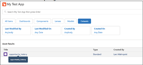
  3. Choose the opportunity_history dataset, which will open a new tab, shown below, with a lens for exploring the dataset.

Figure 8.10: Opportunity_history dataset details

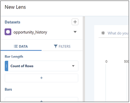
  1. In the New Lens tab, click on Count of Rows located beneath Bar Length, as shown in the following screenshot:

Figure 8.11: Lens builder with Count of Rows highlighted

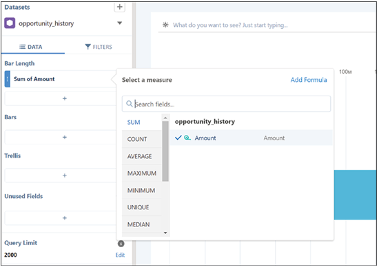
  1. Select Sum and then choose Amount from the dropdown menu, as shown in the next screenshot:

Figure 8.12: Sum Amount selected

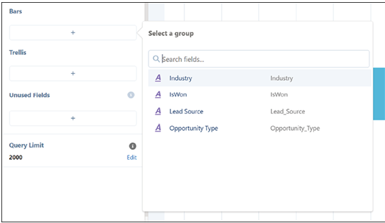
  1. Under Bars, click the plus sign (+) and select Industry, as shown below:

Figure 8.13: Industry field added to lens

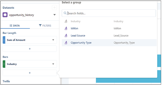
  1. Click the plus sign (+) under Bars again, and choose Opportunity Type, as shown below:

Figure 8.14: Opportunity Type added to lens

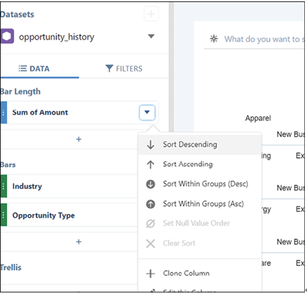
  1. Under Bar Length, click the arrow next to Sum of Amount and select Sort Descending, shown in Figure 8.15:

Figure 8.15: Sort descending selected

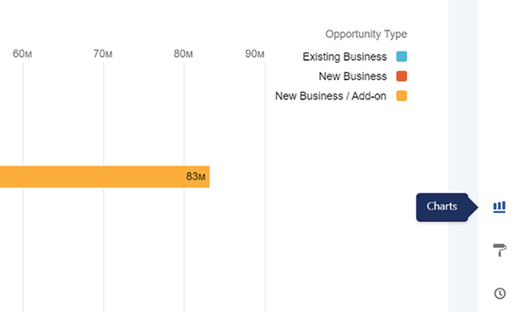
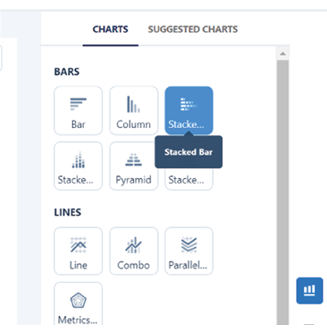
  1. Click the Charts icon to access different chart options, shown in the following screenshot:

Figure 8.16: Charts icon highlighted

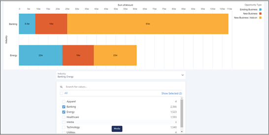
  1. Select the Stacked Column chart icon, shown in the screenshot below, to create a Stacked Column chart, which will display the sum of the amount according to the industry.

Figure 8.17: Stacked column chart selected

  1. Save your lens by clicking the Save button.
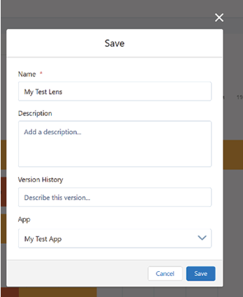
  2. Enter My Test Lens, indicated in the following screenshot, as the title of your new lens, and then choose App | My Test App from the dropdown menu.

Figure 8.18: Save lens dialogue

  1. Click Save to complete the process.
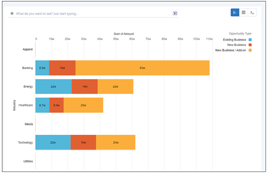
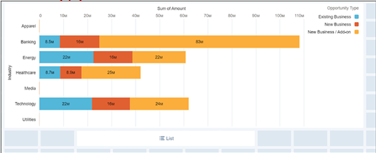
    Your final product should look like the following:

Figure 8.19: Completed stacked column lens visualization
With your app, dataset, and lens now created, you can proceed to create a dashboard.

More Details
Dec 4, 2022
Importing a dataset – Blending Tableau with Traditional CRM Analytics

Importing a dataset

CRM Analytics can work with many different kinds of data, both internal to the Salesforce platform and external, such as in a Snowflake data warehouse. To keep things simple, we will simply get our data from a CSV file. Start by downloading the file: https://developer.salesforce.com/files/opportunity_history.csv. This file is used for several Salesforce tutorials, and we will make use of it as well, for instance: https://trailhead.salesforce.com/content/learn/modules/einstein-discovery-basics/build-your-crm-analytics-dataset.

Our next step is, therefore to import the data from the CSV file into a CRM Analytics dataset, which can be done using the following steps:

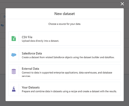
  1. On the Analytics Studio home tab, click Create, select Dataset, and then choose CSV File, as shown in Figure 8.5:

Figure 8.5: Dataset creation menu showing CSV file option

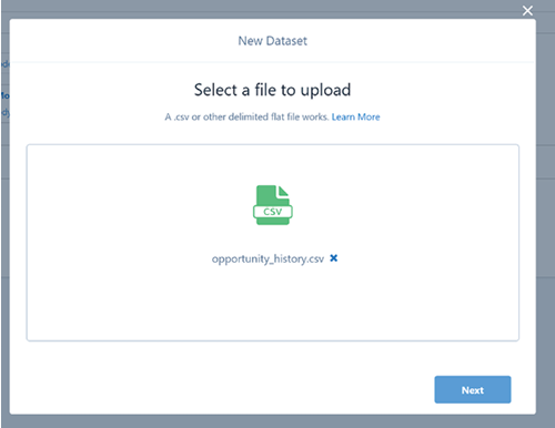
  1. In the file-selection window that opens, locate the CSV file you downloaded, opportunity_history.csv, select it and then click Next. You can see this in the following screenshot:

Figure 8.6: File selection dialogue

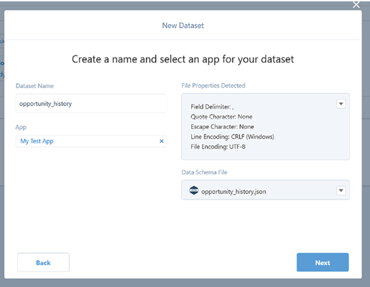
  1. In the Dataset Name field, you can change the default name (opportunity_history), as shown below. By default, Analytics Studio uses the file name as the dataset name, which cannot exceed 80 characters as shown in the following figure:

Figure 8.7: Dataset name field

  1. Choose the app where you want to create the dataset. By default, Analytics Studio selects My Test App.
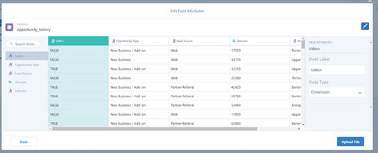
  2. Click Next. The Edit Field Attributes screen appears, shown in Figure 8.8, where you can preview the data and view or edit the attributes for each field.

Figure 8.8: Edit field attributes screen

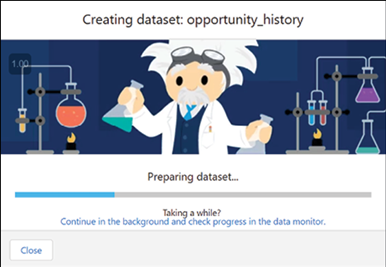
  1. For now, accept the defaults and click Upload File. Analytics Studio uploads the data, prepares, and creates the dataset while showing progress as it occurs. You can see this in the following screenshot:

Figure 8.9: File upload progress
Once finished, you will see details about the dataset you created. If you do not see the dataset details, check your Datasets or search for opportunity_history in Analytics Studio.

More Details
Nov 8, 2022
Creating an analytics app – Blending Tableau with Traditional CRM Analytics

A CRM Analytics app is a comprehensive collection of analyses, data exploration paths, and powerful tools designed for in-depth, real-time data examination. CRM Analytics relies on apps to organize data projects, run presentations directly from dashboards, and manage asset sharing.
To get started with creating an app in your CRM Analytics-enabled Developer Edition org, follow these steps:

  1. Open your CRMA Developer Edition org.
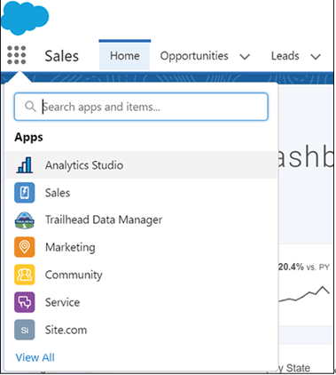
  2. Access the App Launcher and search for Analytics Studio. Select it to open Analytics Studio in a new tab. Keep both tabs open, as you will need to work on the original tab later in the project. This is shown in the following screenshot:

Figure 8.1: App Launcher showing Analytics Studio

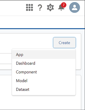
  1. In Analytics Studio, click the Create button and select App from the dropdown menu, as shown below:

Figure 8.2: Create menu dropdown showing App option

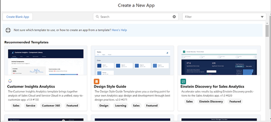
  1. Choose Create Blank App to start with a clean slate, as shown in the following screenshot:

Figure 8.3: Blank App creation dialogue

  1. Click Continue to proceed to the next step. Enter My Test App as the name of your new app, as shown below:

Figure 8.4: My Test App creation dialogue

  1. Click Create to finalize the app creation process.
    Congratulations! You have successfully created an app in CRM Analytics. We will now move on to importing a dataset.
More Details
Oct 16, 2022
Creating Datasets, Lenses, and Dashboards in CRM Analytics – Blending Tableau with Traditional CRM Analytics

In CRM Analytics, the most basic concepts are app, dataset, lens, and dashboard. These are the basic building blocks to understand to be able to work in the system, although, of course, they are just the beginning.

Before we dive into the practical steps of creating a dashboard in CRM Analytics, let’s briefly familiarize ourselves with the fundamental concepts of app, dataset, lens, and dashboard. Understanding these components is crucial as they form the backbone of CRM Analytics.

  • App: In CRM Analytics, an app serves as a container for your analytical projects. It’s a workspace where you can organize your datasets, lenses, and dashboards. Think of it as a folder on your computer where you keep related files together for easy access and organization.
  • Dataset: A dataset is a collection of data that CRM Analytics can process. This data can come from various sources, including Salesforce records, external databases, or files like CSVs. Datasets are the raw materials from which you extract insights.
  • Lens: A lens is a tool for exploring a dataset. It allows you to visualize data in different formats (such as charts or tables), filter the data to focus on specific aspects, and perform basic analyses. You can think of a lens as a magnifying glass that helps you examine the details of your dataset.
  • Dashboard: A dashboard is a visual representation of your data analyses, often comprising multiple widgets (charts, tables, etc.) that display data from one or more datasets. Dashboards are designed to provide at-a-glance insights and support decision-making.

Now that we have a basic understanding of these concepts, let’s proceed to create a simple dashboard in CRM Analytics to give you a feel for what you might be able to achieve if you were to dig deeper into the topic.

We will do this in a few steps:

  1. Create an app to hold your unique analytical assets.
  2. Import a dataset into the system.
  3. Explore this dataset through a lens.
  4. Build a simple dashboard to visualize the data.

Doing this will also teach you some of the key differences between creating dashboards in Tableau and doing so in CRM Analytics and why you might prefer one over the other in particular cases.

Let us begin!

More Details
Aug 7, 2022
Conclusion-Integration, Authentication, and Tableau Viz LWC

It is important to note that Tableau-connected apps and Salesforce-connected apps are different and offer distinct functionalities. Currently, Tableau connected apps are intended for embedding Tableau views and metrics in external applications and authorizing access to the Tableau REST API.
Generally, you should not use a Connected App with Salesforce. The one exception might be if you are planning to use the same app across several target systems that need to embed information from Tableau and should be managed in a consistent way. You would just be creating more trouble for yourself.

Finally, there is the option of embedding Tableau Dashboard as a canvas app using the Sparkler framework. This used to be the preferred way of embedding Tableau Dashboards into Salesforce, but it has now been superseded by the Tableau Viz LWC Component. The setup for this option is very complex. It involves a Java-based application, Sparkler, which can be used to embed Tableau dashboards in Salesforce using Salesforce’s canvas framework.

To set up Sparkler, you must download the adapter, create a virtual machine to run it, install Java 8, install Tomcat, enable HTTPS for Tomcat, install Sparkler, configure secure communication between Sparkler and Tableau Online, and configure a connection between Salesforce and Sparkler.

Finally, you must embed and filter the dashboard on a record in Lightning Experience by creating a new Visualforce page and customizing the record page. All in all, not something you want to do, given other options. However, you should know it as you could see it in a legacy environment.

Conclusion

In this chapter, we have provided a comprehensive guide on integrating Tableau with Salesforce using the Tableau Viz LWC component. You have learned the purpose and benefits of this integration, as well as the process of installing and configuring the Tableau Viz LWC component for seamless integration in Salesforce.

Furthermore, we have delved into advanced usage techniques, including the creation of custom visualizations and modifying the component’s settings. We have also covered the implementation of Single Sign-On (SSO) between Salesforce and Tableau to streamline the authentication process and enhance security.

Additionally, we have explored alternative methods for connecting Salesforce and Tableau dashboards, such as direct connections and third-party integration tools. With the knowledge gained from this chapter, you are now well-equipped to enhance your CRM analytics in Salesforce using the Tableau Viz LWC component and make more data-driven decisions to drive business success.

In the next chapter, we will dive deeper into how you can combine Tableau with CRM Analytics to create game-changing analytical use cases.

Join our book’s Discord space

Join the book’s Discord Workspace for Latest updates, Offers, Tech happenings around the world, New Release and Sessions with the Authors:

https://discord.bpbonline.com

More Details