Mar 13, 2023
Making a dashboard – Blending Tableau with Traditional CRM Analytics
A dashboard is an engaging compilation of widgets that display the results of data queries. In this section, you will create a dashboard with an interactive chart and a list widget. You will incorporate the lens from the previous step and explore tools in the dashboard designer.
To incorporate a lens into a dashboard, you need to clip it. Clipping the lens allows CRM Analytics to add the query as a step in a new dashboard (or the most recently used open dashboard).
- In your newly created lens, click the Clip to Designer icon, marked in the following screenshot, to clip the query.
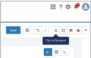
Figure 8.20: Clip to designer icon
- Under Display Label, enter Breakdown by Industry and click Clip to Designer.
- CRM Analytics will open the dashboard designer and add the query in the query panel. Breakdown by Industry will be displayed under the opportunity_history dataset.
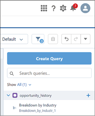
Figure 8.21: Lens added to designer with query name showing
- Drag the Breakdown by Industry query onto the new dashboard grid.
- Resize the chart by dragging its corner to make it larger. The result should look like the following screenshot:
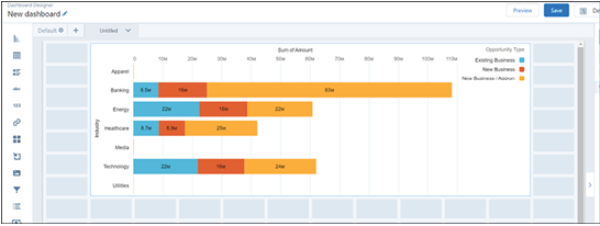
Figure 8.22: Query chart resized on dashboard
Widgets are the basic building blocks of a dashboard, providing various functions such as displaying key performance indicators, filtering dashboard results, visualizing data using interactive charts, or showing record-level details in tables. In this step, you will add a list widget to enable dashboard users to facet all the charts in the dashboard.
- Drag the List widget icon, shown in the screenshot, from the left side onto an empty space on the dashboard underneath the chart.
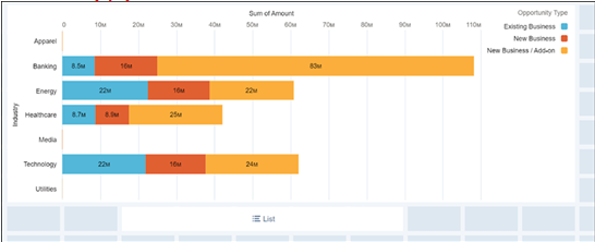
Figure 8.23: List widget being added to dashboard
- Click on the List widget and select Industry.
- Click Create in the window shown in the next screenshot:
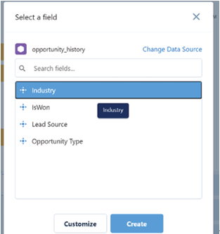
Figure 8.24: Industry field selected for list
- Select the list widget by clicking on it.
- In the Properties panel on the right, click the Query tab.
- Ensure that both Apply global filters and Broadcast selections as facets are selected.
- Under Selection Type, choose Multiple Selection, shown in Figure 8.25:
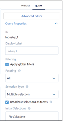
Figure 8.25: List widget properties
- Save your dashboard by clicking the Save button.
- Enter My Test Dashboard as the title of your new dashboard, and select App | My Test App from the dropdown menu, as shown below:
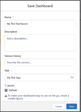
Figure 8.26: Save dashboard dialogue
- Click Save to complete the process. You can preview your dashboard, which should look like this:
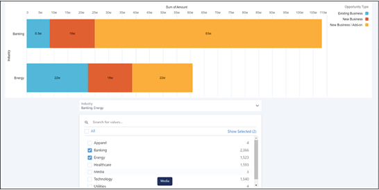
Figure 8.27: Completed test dashboard
You have now created a basic dashboard. We hope you will explore the potential of CRM Analytics much further on your own, but for now we will move on to Einstein Discovery, the machine learning engine that powers CRM Analytics.
